BoMo
Bolinches Montañana Grafistas
Bolinches Montañana Grafistas
When Patricia Bolinches (Bo) and Bea Montañana (Mo) asked me to do the lettering for the identity of their graphic design studio I was very happy, there is no better client for a lettering that someone who really wants it as identity. The briefing was clear:
- Two parts that work together as a team
- Professionalism
- Neither modern or too minimal
- Love for work
- Care
- Evolution
- Maturity
- Feminine sensibility
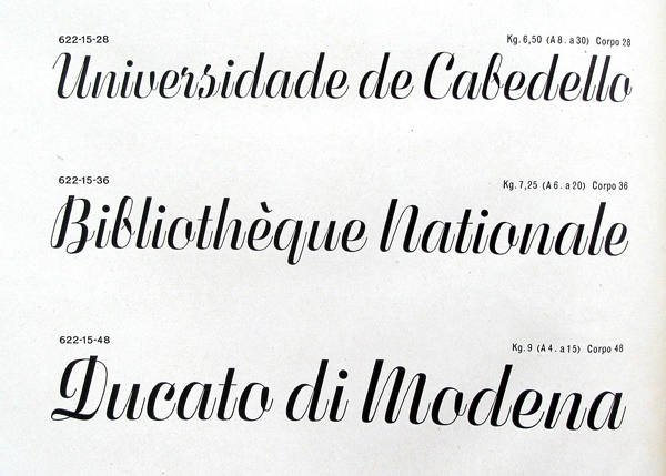
My first idea was a stencil, but I soon switched to a calligtaphic script, this is how I arrived to the specimen Fluidum, a typeface designed by Alessandro Butti in 1951 for the Niebolo Typefoundry.
I digitised and customized the characters for the logotype with no italic construction but different contrasts, ligatures and versions.
You can see more images of the identity at BoMo Behance page


The stationery of BoMo was designed by the members of the studio, as they wanted to have a stamp, I designed a special version of the logotype in two lines for that purpose.

The stationery was designed by Patricia and Bea, the designers at BoMo.They conceived it as a puzzle that deconstruct my lettering. © Photo: BoMo

Detail © Photo: BoMo

My starting point was the original specimen of Fluidum, a typeface designed by Aldo Novarese in 1951 for the Niebolo Typefoundry

Different versions

